
Sketchbook
I don’t often sketch for the sake of sketching, but lately I’ve found it to be relaxing. Here’s a digital sketch (using Procreate) of my backyard topiary.

Green Build Illustration and Ad
Wanted to challenge myself by creating a realistic illustration in Photoshop. So, I created this construction worker. Then, because I’m a sucker for green architecture, I thought it would be fun to use him for an ad for green building. I created a technical-style illustration of a container home along with a leaf icon for this ad mockup. I think it would be great as a billboard.


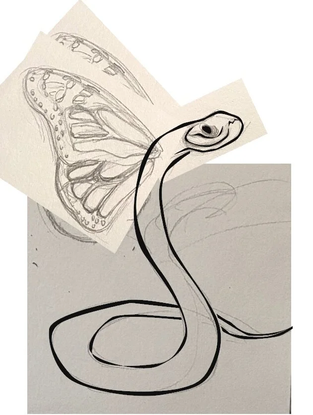
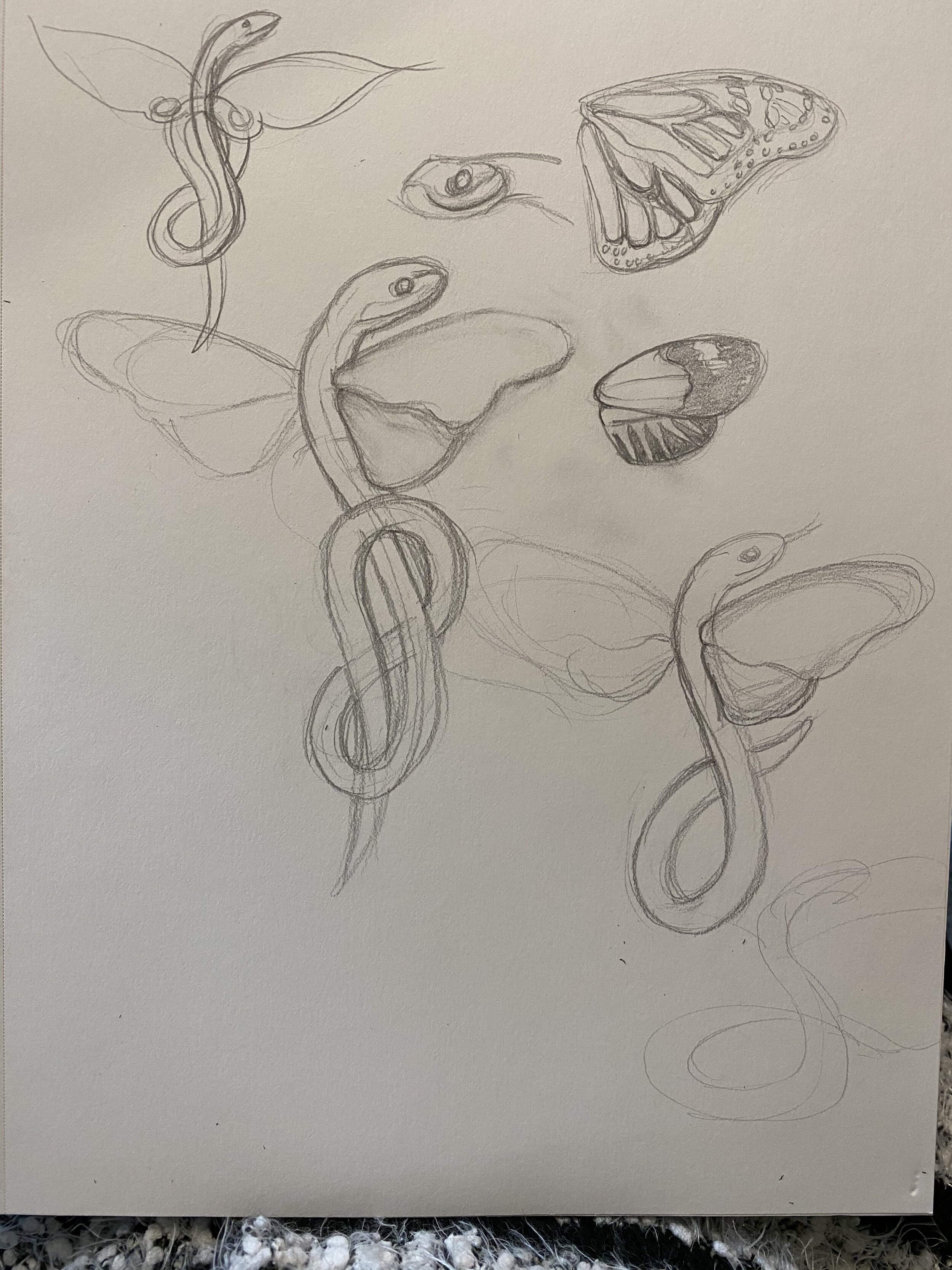
Fantasy Creature
When you get the opportunity to illustrate a snake butterfly you take it! The creature below was Frankensteined together for a self-publishing client as a spot illustration for his upcoming book. A few process images are posted below it.


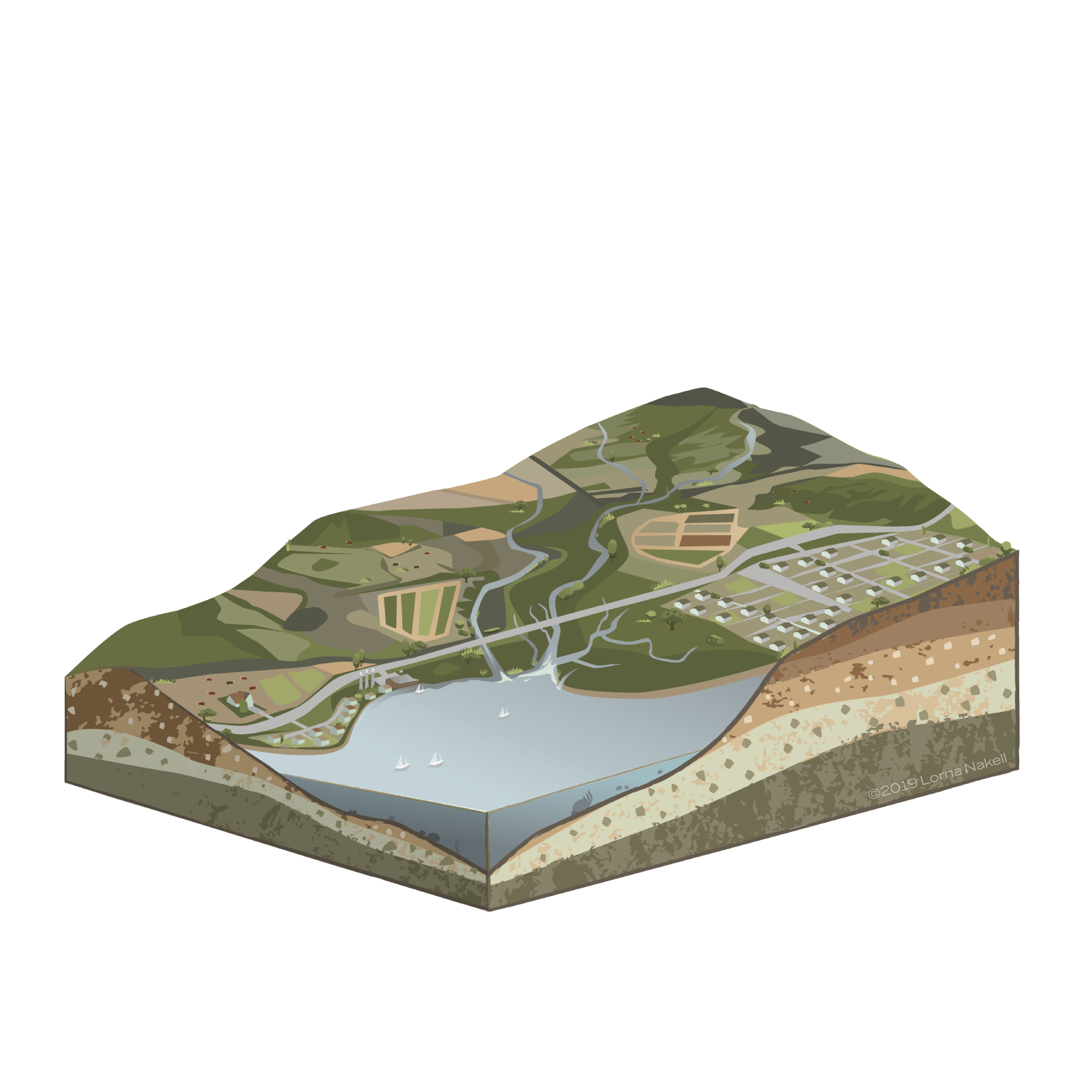
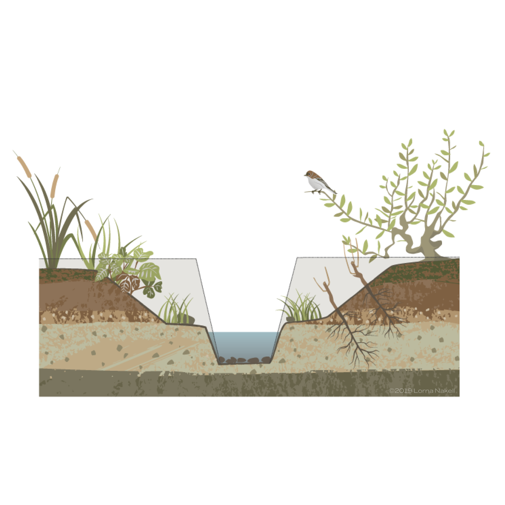
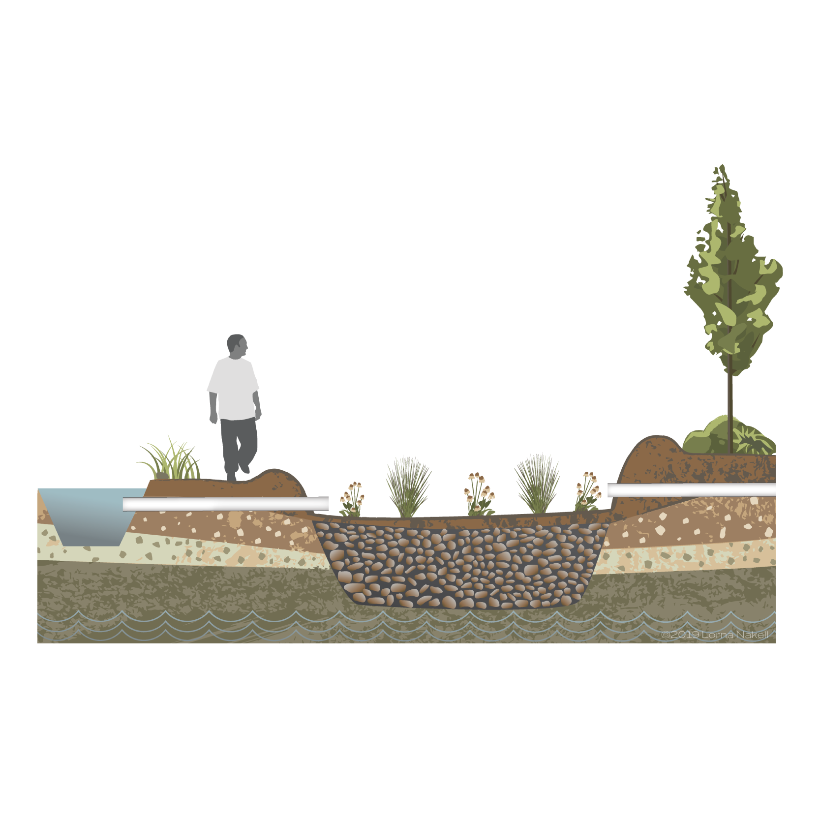
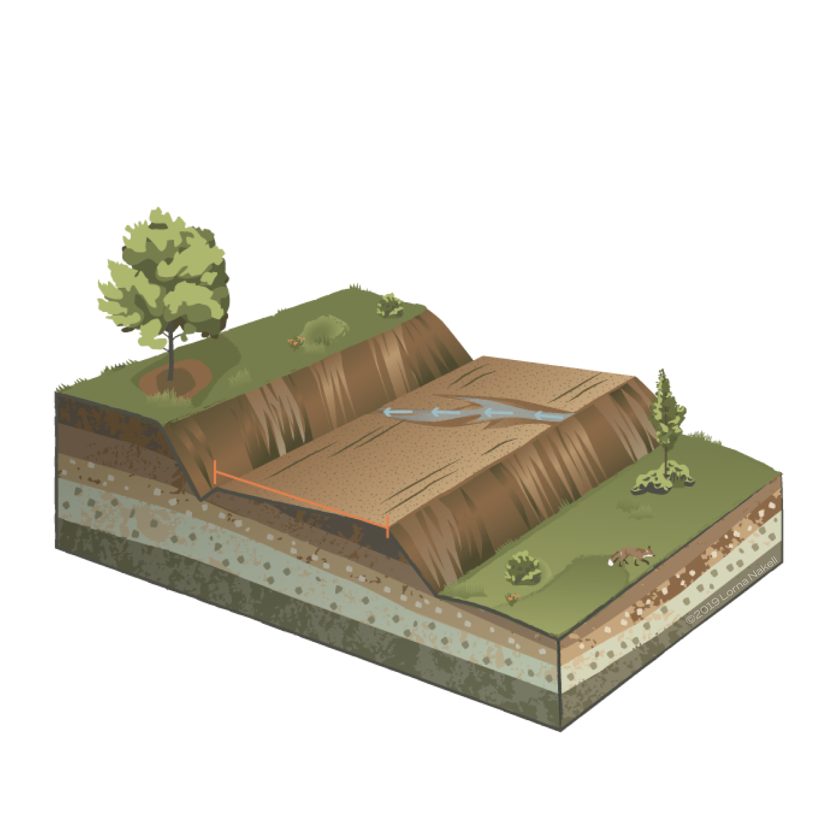
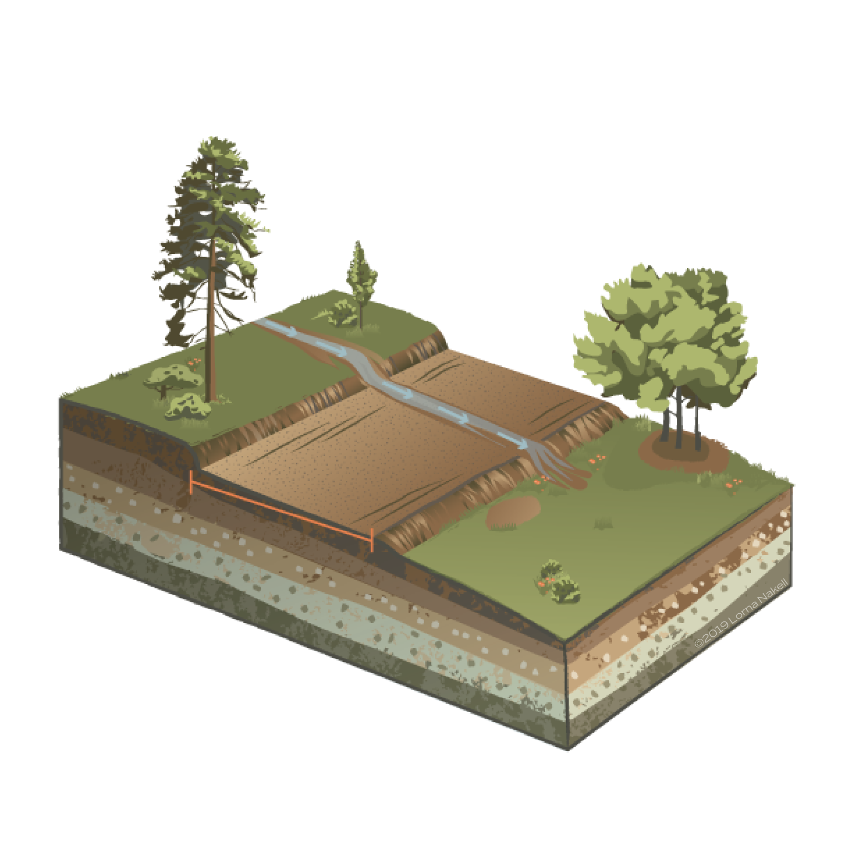
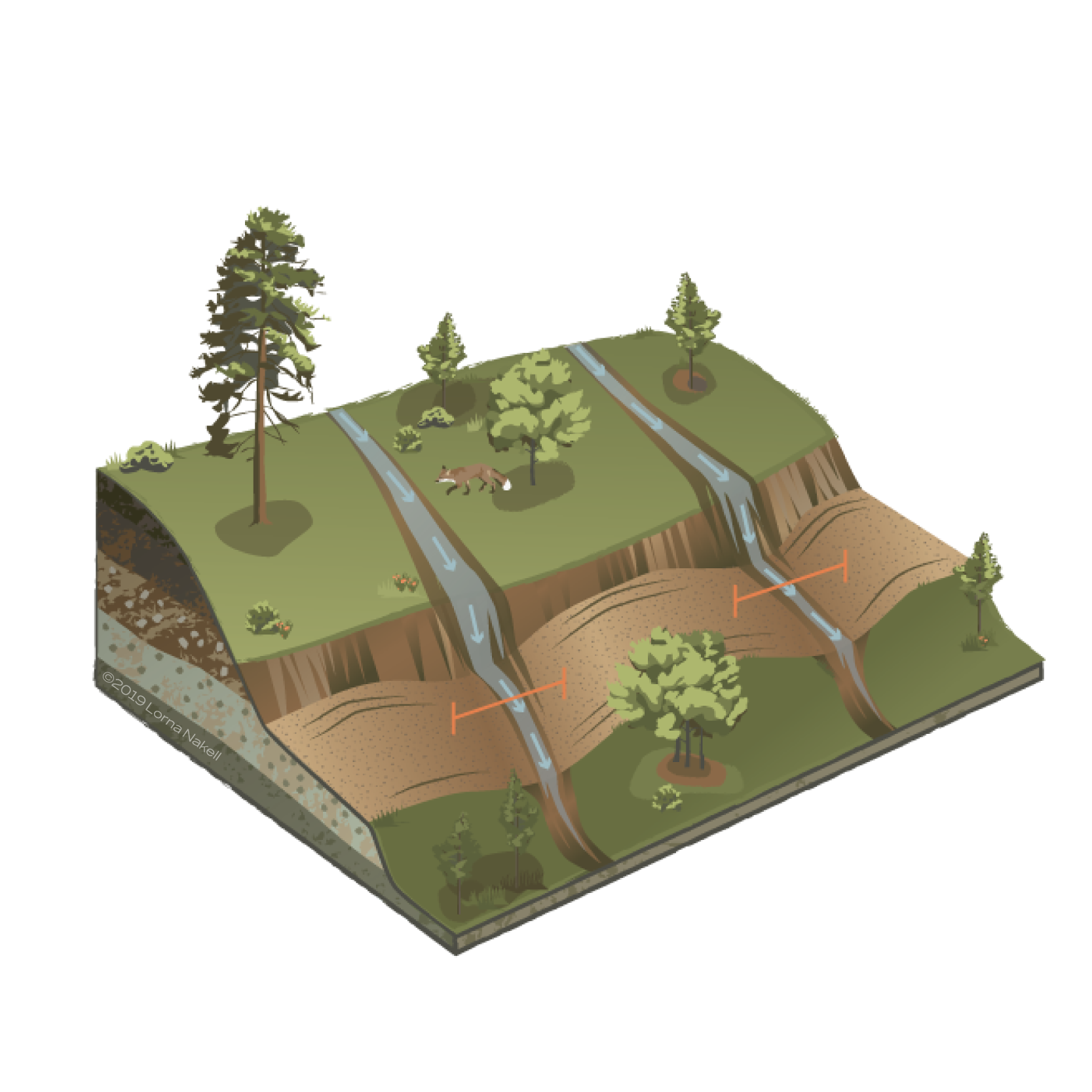
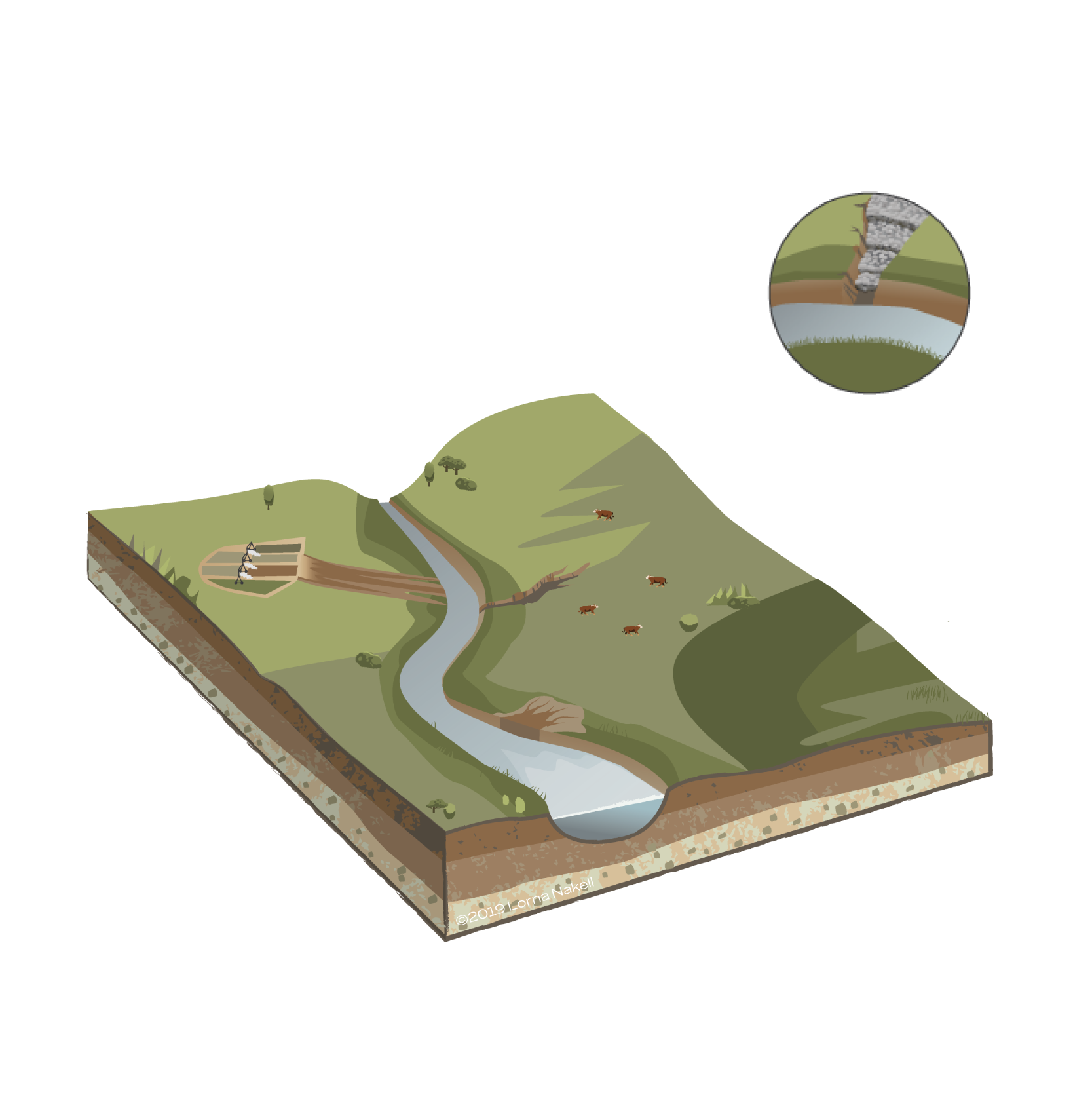
Environmental Technical Illustrations
Thanks to Morro Bay Estuary, I had the opportunity to try my hand at doing a suite of technical illustrations to help them explain some key land management issues and preservation techniques. The illustrations are for use in the organizations outreach materials and presentations. So they were designed in a way that users could create their own annotations based on specific communication needs.

This is an illustration as part of a presentation template I designed.
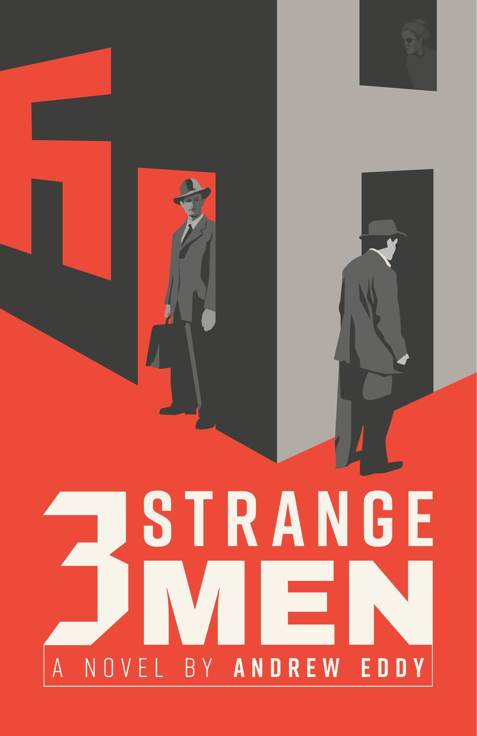
Fresh Book Cover Art: Round 2
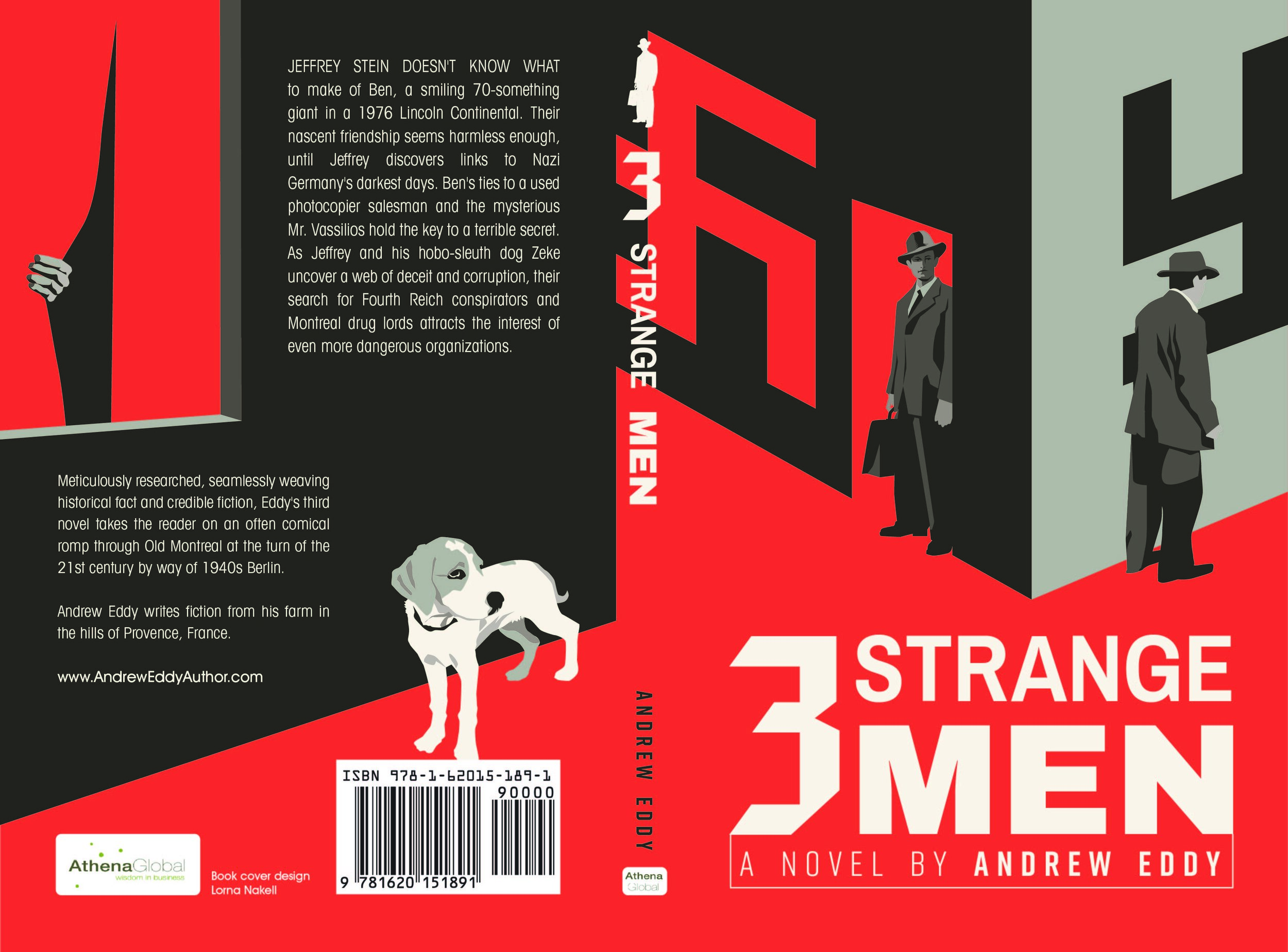
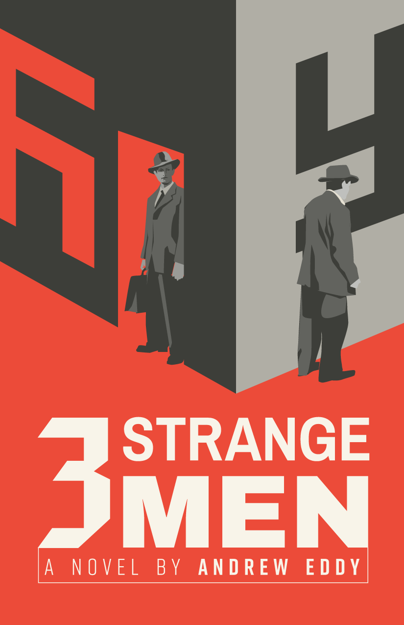
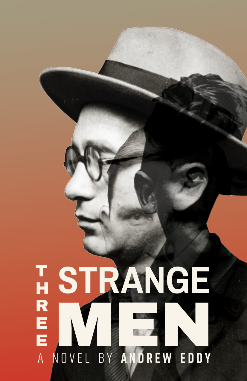
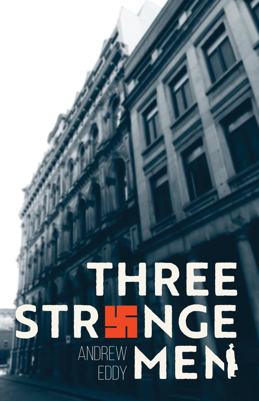
This is the most recent book I illustrated and designed for Andrew Eddy. Three Strange Men is now available on Amazon. Below you can see the final illustrated cover, plus bonus material in the form of the three original digital illustration/photo concepts that were presented to him.
Fresh Book Cover Art
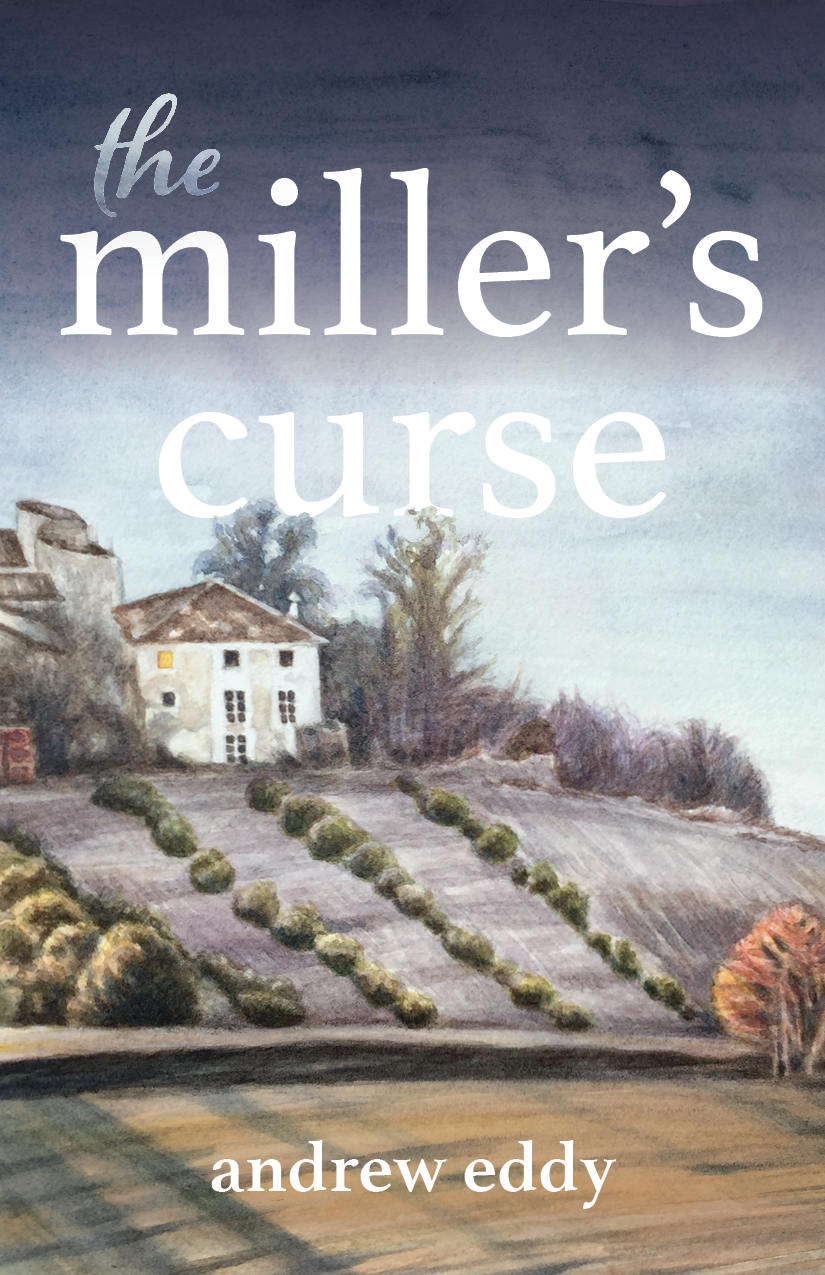
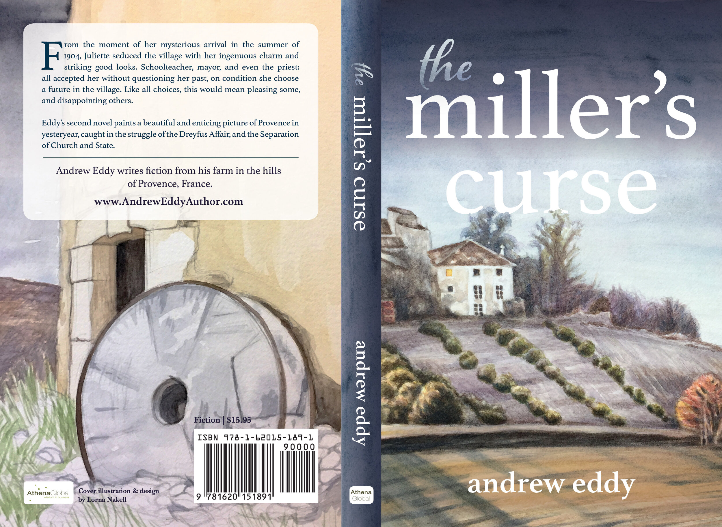
Celebrating the end of the year with the completion of a few projects. Here’s the book illustration and design I did for Andrew Eddy’s second book, The Miller’s Curse, now available on Amazon.
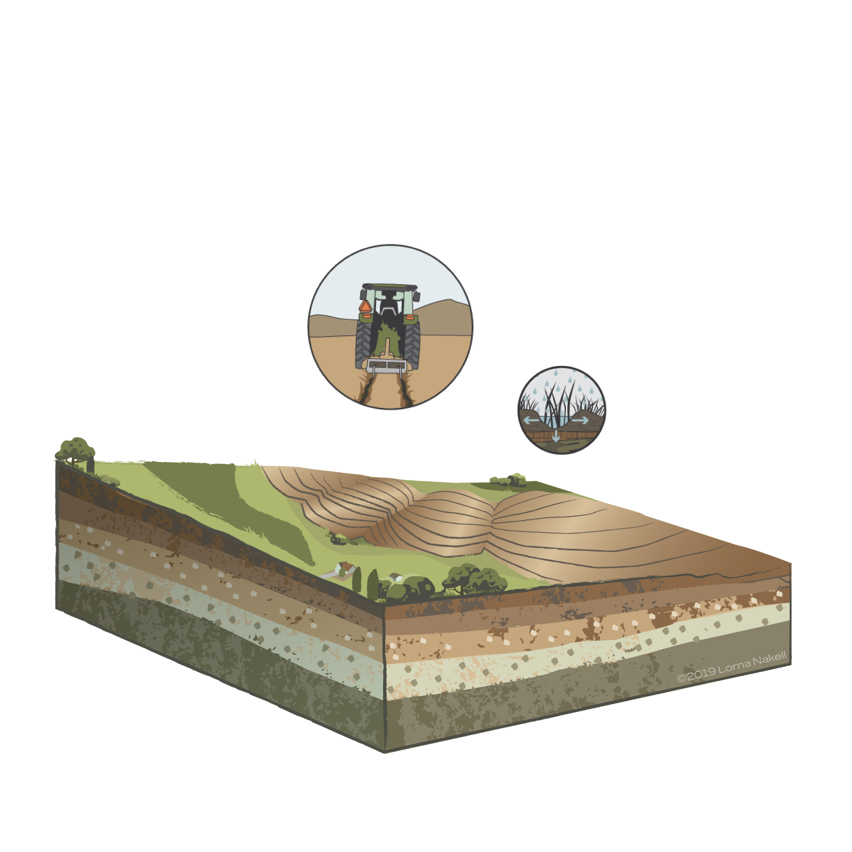
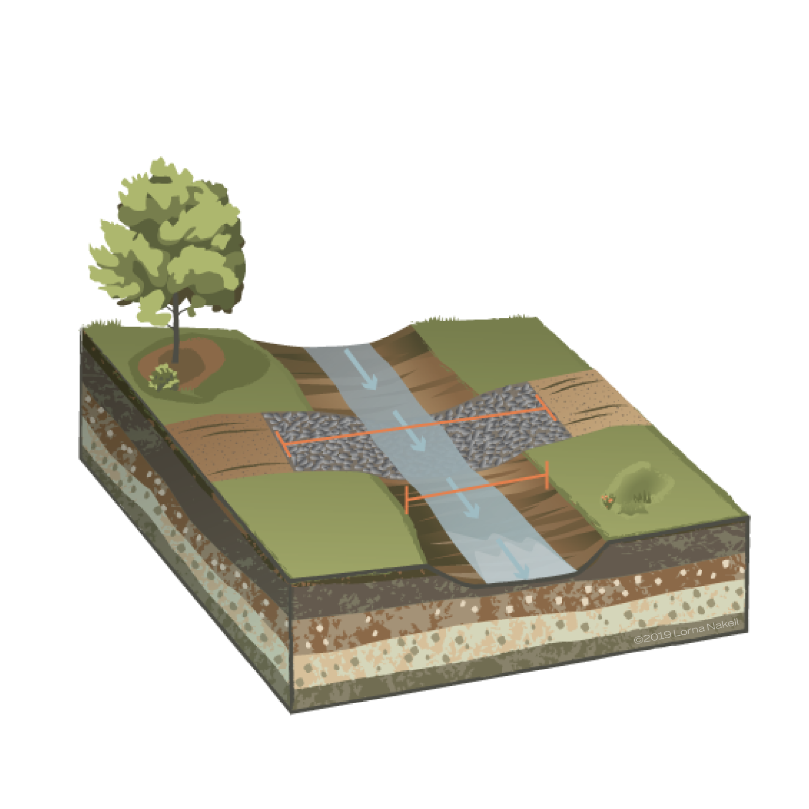
Technical Illustration in Progress
Working on a technical, ecological illustration providing information about water systems. These are 2 of 7 illustrations that are being developed for a California client.


Photoshop Illustration in Progress
A potential client was interested in a more realistic style of digital illustration for a project. So, I challenged myself to make this. Have some more work to do (building out the forms with highlights and shading and adding some other elements), but it’s coming along. Photoshop has never been my friend, but it’s always fruitful for me to push myself in new directions.

Fun with GIFs
Been working on some GIFs for a client. Here are a few of the ones I created in After Effects and Photoshop.


PP Donation GIF

I turned an illustrated poster I made into an animated GIF for FB. Illustrations were made using Illustrator. Layers were imported into After Effects to create the animation. Then I used a plugin to export as an animated GIF. Tweaking the export options allowed me to turn a normally large file into just 2.2 MB—perfect for sharing. The downside to such a small file size on a moderately complex animated GIF like this is that the resolution is a little lower than ideal. The upside is that you can tell a little bit more of a story.
Sexy Info Org
In the world of design there are the sexy projects—and the frumpy ones. Or at least that's what some say. There are the Nike print ads, and then there are Word Doc templates. But, I think all projects deserve design love. One of the things I like doing as a designer is getting a simple document (preferably one that's just a wall of text) that has no clear design direction and finding the best way to organize information and present it in a clean, and sometimes fun, way. It's the nerdy part of designery. You need your Word Doc research table branded, or a more engaging one-sheet? I'm your gal! You've got some boring charts and graphs to share, let me at 'em.

Left: Original flyer design that was posted in patient services checkout areas and presented in plexiglass stands. This design is fully branded with colors and approved icons, but lacks personality and warmth. The information could also use some help with hierarchy. Right: This is my redesign. I chose one branded color and created a monochromatic design. The concept tells more of a story and brings the viewer into an Oregon-inspired scene. The heart icon is reimagined. Gifts from the heart spring from an envelope. Giving info is provided on a stamp. The hand is in grayscale, and is gender neutral because my designs need to be representational of Planned Parenthood's goals for equity and inclusion.

Left: This was the MS Word table I was provided with and asked to brand and make more accessible. The end product was an internal cheat sheet for staff. Right: This is the cheat sheet branded (with logo and color) and turned into a clean and easily readable flow chart. It's important in design to know when artsy is needed, and when functionality rules. This was a case of the latter, so that's what I delivered.
Organizing information takes many forms depending on the content and audience. Even the driest material can be turned into something enjoyable to experience, or at least pleasant to look at. The most important tools for this design process are understanding the content and developing a hierarchy with design elements, size and placement of headers and body text; using color as a branding tool; and utilizing image for storytelling when the opportunity presents itself.
Illustrated PDX Weather Animation
I've been learning some more fun stuff at HOW Design University. I'm currently working on my Certificate in Animation. For the first assignment we were asked to do an animation about the weather. We were given some rain drops and an umbrella and told to use them, or make our own illustrations. So, I created all my own illustrations (landscape, people, rain, umbrella, etc.) and made my animation into a mini animated infographic (since that's one of my end goals in learning After Effects). I added informative copy, and some bouncy music. It could use a little more work on timing and face animation, but I feel like I'm headed in the right direction.
HOW University Infographic Certification
I just got my How University Infographic Certification. Now I'm ready to rock and roll on more projects that combine my artistic and information organization skills. Below is the infographic I designed with content provided by Jessica Mehta of MehtaFor. I also created an interactive PDF based on the infographic. You can email me if you'd like to take a look at that. Unfortunately, Squarespace doesn't support interactive PDFs.
Flat Illustration Infographic Panel

I've been working on some more flat illustrations for my portfolio with a goal of building a strong collection of infographics. Here's a panel from an infographic I'm working on titled, Key Ingredients for a Healthy Life.
One of the new challenges for me working on this illustration was creating the coffee steam. I discovered a handy trick incorporating the mesh and warp tools. Possibilities within Illustrator are truly endless.
Vector Avatar Illustration

Decided to challenge myself to create a personalized vector avatar for use in social media. This was created in Illustrator with the pen and shape building tools.
A Troll Birthday Party Illustration

PROJECT:
A while ago I received a special request to create an illustration for a self publisher's children's book. The task was to create one illustration for the first story in her book, which was focused on a troll's birthday. But not just any birthday, a big centennial birthday. The party was to incorporate a selection of main characters from the story, including two humans. Aside from relatively detailed descriptions of some of the characters, I was given free reign—hee hee.
PROCESS:
My goal was to bring the characters to life and make each one look like they have their own personality—like you would want to chat them up at the party—and to create a magical place for them to gather. I planned an outside party to accommodate one extremely large troll, and a floating one named Star. After creating a character sketch for Stamp, the birthday boy (see previous blog post), I proceeded to map out and complete the full party scene. I took the liberty of adding some fun touches like the snake and frog, whom I thought would also be really excited to join the festivities, as well as some other little surprises...
Below are some process photos.


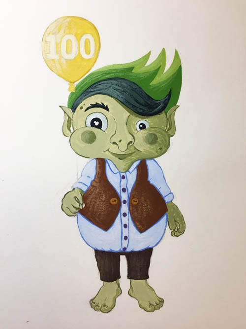
Character Sketch
I'm working on some children's book illustrations for a self publishing author. Below are a few different stages from the character sketch painting process of a troll named Stamp. I actually started creating the sketch in Illustrator, but switched to gouache because it was a lot easier for me to produce the line work and shading that I wanted.


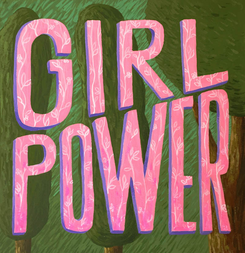
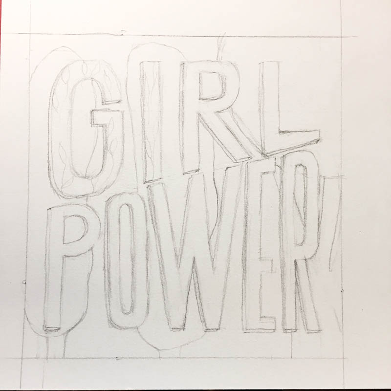
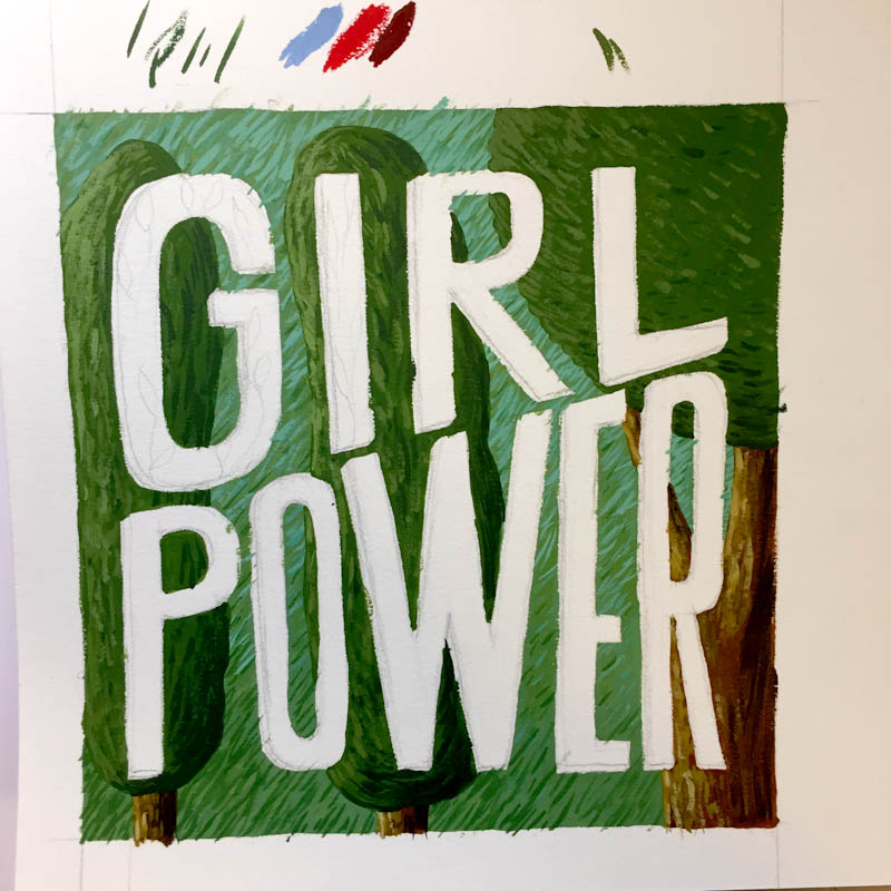
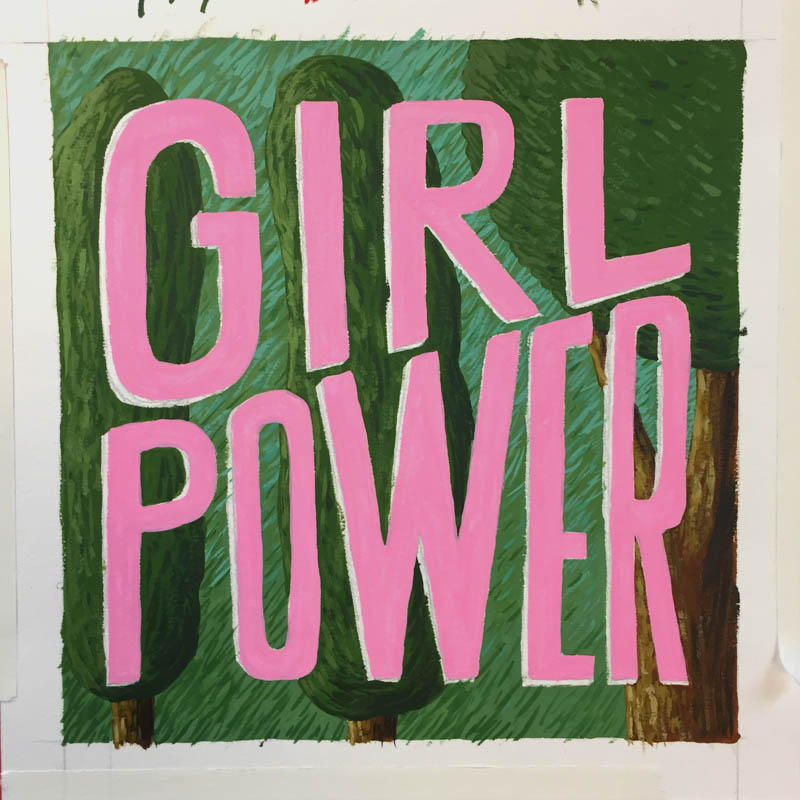
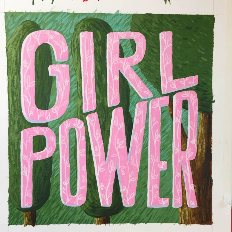
Process: Girl Power Card
As part of a maternity present I created a hand painted card. It was made using gouache on Bristol paper. The inspiration came from spring and a children's book a just got from the library called A Wizard in Love.


Process: Children's book cover design
PRE-DESIGN
Even before a children's book is placed into the hands of a designer, there are many working pieces that have to be juggled by several different people. It can take several months to years for a writer/illustrator to develop a story for children. Often times, the writer and illustrator are separate people; paired together only after the manuscript is completed and taken on by a publisher. The writing alone, can take many passes by a variety of editors (developmental, copyeditors and proofreaders) to have it developed into a workable story.
THE DESIGN PROCESS
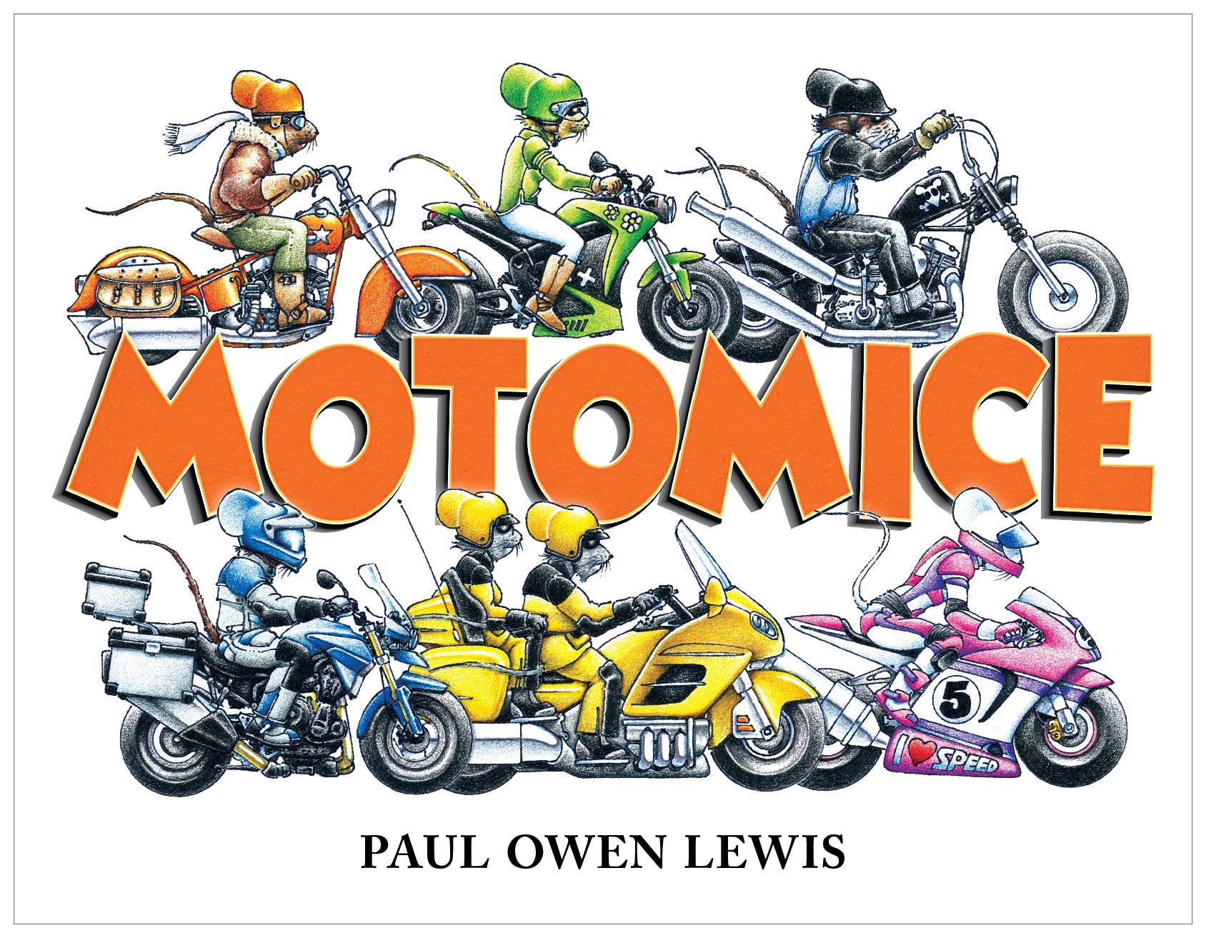
Below is list of several of the steps I went through to create the cover design of MotoMice, by Paul Owen Lewis. This book is being published by Beyond Words. Customarily, the author/illustrator doesn't have much say in the final design, but in this case I had to bend some of my conceptual input to his original vision. Also note that this whole process was done with several rounds of comps revised with copy and design edits from the author/illustrator and managing editor.
Step 1: I took professionally photographed artwork into Photoshop and removed the paper background, cleaned up any scruffy edges and deleted areas of the bikes that you would be able to see through. There's an art to this because at times you have to interpret the intention of the artist when erasing visual content.
Step 2: Colors of the cover artwork were adjusted in Photoshop to match the illustrations used in the interior, which were slightly more saturated. This artwork was then exported from Photoshop and used in Illustrator.

Top: Raw illustration provided by author/illustrator. Bottom: Artwork with background erased in Photoshop, and color corrected to match interior art that was more saturated.
Step 3: The fonts for this cover had already been chosen by the author/illustrator, but I made changes. I did a basic adjustment to the tracking and kerning of the author name for a more balanced look. But, the biggest typographic change was turning the title into 3D art lettering. For this, I used Illustrator to create the 3D gradient shadow effect (with the blend tool) and to build the separate layers of color, texture and transparency for the orange front. Then I exported it as a high resolution JPEG and sucked it back into Illustrator so I could use the mesh tool to create a slight warping effect.

Top: Original unaltered font. Middle: Illustrator layers used to build a more 3D textured version. Bottom: Mesh tool used in Illustrator to manipulate the shape of the word art.
Step 4: The final design was then exported and placed into InDesign where I completed the full dust jacket. The dust jacket had additional artwork that required the same type of cleaning up and color adjustment. Then all copy was placed and typeset. Typesetting requires the same sort of love and care as dealing with artwork. Some considerations are the right fonts, paragraph formatting, colors. Then there are the details like replacing hyphens with En dashes in between numbers, controlling the use of hyphenation—fun stuff like that.

Full cover layout. Color adjustments were made to all illustration elements. An outside glow was placed on the bottom row of mice so they move to the front of the letters, and a drop shadow was created just behind each overlapping letter tip to move the title in front of the top mice row. The same title letter art was used for the drop caps on the dust jacket flaps.
Step 5: For press, the InDesign file will be exported as a print quality PDF with printer marks in place, and fold marks placed in the slug.
All of that for a simple children's book cover? Yes. And it's important not to miss a step because you have to make the 4–8 year-old kiddos happy and inspired to sit down and learn about the importance of motorcycles and family through the use of kick-ass mouse illustrations.
Coming up: a post about the interior design process for MotoMice.
To see more book offerings by Paul Owen Lewis you can visit his website: www.paulowenlewis.com
Low Poly Squirrel Poster
Thanksgiving is almost here. The leaves are busily falling from the trees, the rain has paid us more visits, and all the little neighborhood critters are busily foraging for winter foods and house bedding. Inspired by the speedy and often unseen squirrels that dart impulsively across our streets, I decided to create a poster—a royal squirrel crossing awareness poster. Hope this helps, my little friends! :)
