Outtakes-Designs that Didn't Make the Cut
Designing happens in many stages. I often start with a design brief to acquire all necessary info, create moodboards to explore look/feel options, create two or more comps to give layout choices, then make several revisions of the final client choice before pushing the end product out the door. During that process some concepts are left behind never to see an audience, often never to even see outside the computer where they were conceived. I call these lost concepts "outtakes." I believe there is value even in these project remnants. Just because they weren't right for the client or ideal for one particular project, doesn't mean there isn't potential in them for future design work. In the spirit of showing more process, here are some of my outtakes from the past couple of years.

This was a book cover comp that I felt ticked many boxes, but was maybe too quirky. It also didn't include a color palette that was desired by the client. The final cover is in the "books" section of this website.

This book cover was similar in style to the author's previous cookbook, but didn't convey the idea of the 8x8 pan as well as the chosen layout (seen in "books" section of website).

Originally this was just a blk/wht gouache painting presented as a cover option for The Less We Touch. It was too ominous and didn't provide enough whitespace for the title. I chose to finish it up in Illustrator.

This was a concept for title pages for None Call Me Dad. Sometimes elements like this are just out of the project budget. It also wouldn't have fit with the cover design that was chosen.
Creative Practice & Process
These days it's easy for me to become artistically complacent—not keeping up my practice with using traditional materials since most design work required of me is digital. I actually have to assign myself projects that require me to pick up my pencil and paint brush. As a designer and illustrator there are so many techniques I'd like to try as well as skills I want to work to improve. So, I force myself to do hand lettering, create animations, illustrate animals in a cartoon style, etc.. Because the more you work these creative muscles the stronger they get. And, when you leave certain tools behind, they get rusty.
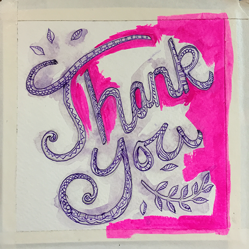
Because I love to see other people's process, here are the steps I took to complete a "thank you" card I made—with traditional media: pencil, gouache, watercolor, and pen on watercolor paper.


Using Illustration for Website Customization
It's relatively easy to build a website these days with all the available templates, but it can be tough to give the final site personality beyond the pre-designed offerings. One way to help personalize web templates or add creativity to custom websites is to incorporate custom icons and illustrations.
Sometimes it can be a challenge to find the exact icon you need to represent a specific action. While working on the Trackers Earth I needed some unique icons for buttons, but I also needed them to all match. So, purchasing someone else's pre-made buttons was not an option. What I ended up doing was creating a custom set of icons for specific buttons—helping customers navigate the site in an artful way.
These are some of the icons I created for Trackers.
As with many brands, the use of story was very important to Trackers. There use of photography worked well for giving the viewer an idea about the adventures to come with class taking. But, the creation of stylized illustrations helped to forward the messaging.

Custom Trackers illustrations I created for use on there website and other collateral.
Sometimes all it takes to personalize a website is just a couple of repeated unique elements. That's where a creative illustrator/designer can step in and step up the branding game!
See the complete project here.
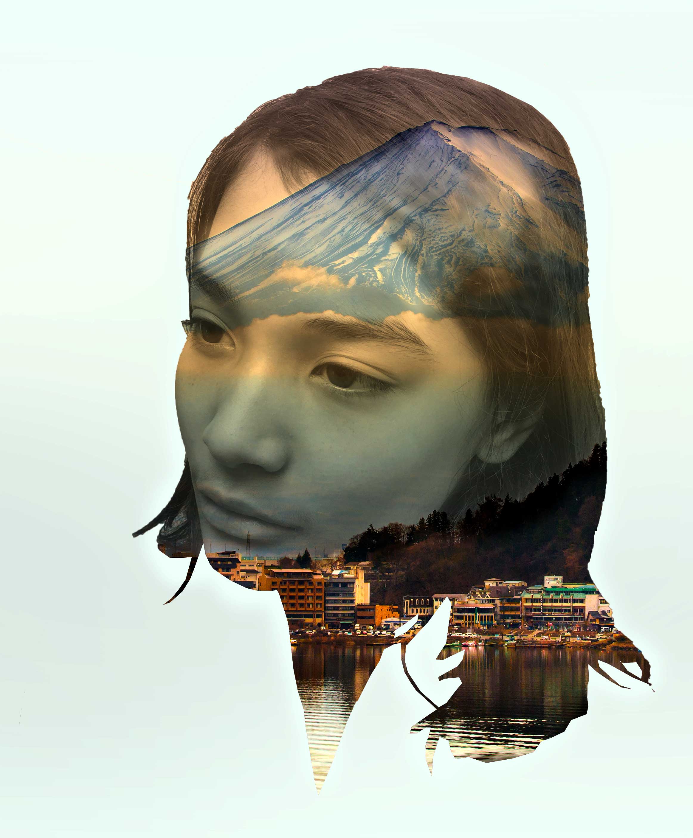
Double-exposure Portrait
Today I challenged myself to create my first double-exposure image in Photoshop. I don't think it's bad for my first one, but I can see how important it is to get the right face/landscape pairing for blending.
For this portrait I combined a photo I took of my son, and an image I downloaded of Mt. Fuji from Shutterstock. This was pretty fun to do. It was also very rewarding, because you can come up with a finished portrait in a couple of hours. There are lots of possibilities with this technique, and I'm looking forward to some more exploration.
Portrait Illustration with Objects
I thought I would share a couple process photos for an illustration I just finished. This illustration was a personal project. I chose items from my son's room that I felt best represented him at this moment in time, and made an illustrated snapshot.

First I laid out a collection of my son's goodies and took a photo with my phone. Nothing fancy.

Then I drew the images in Illustrator, and started coloring them in. I wasn't sure what I wanted to do for the type yet, so I just slapped in a placeholder. I was also still trying to figure out what I wanted to do with the background. At first I thought I might want it to have a paper texture. The one laid in here is linen.

For the final version I chose to go with a clean light blue background, and to do some decorative hand lettering—in a style to match the way I chose to draw the items.
Lettering with Real-world Materials
I've been wanting to do some lettering with objects for a while now. It's good to step away from the screen every once in a while.
The most important meal of the day:

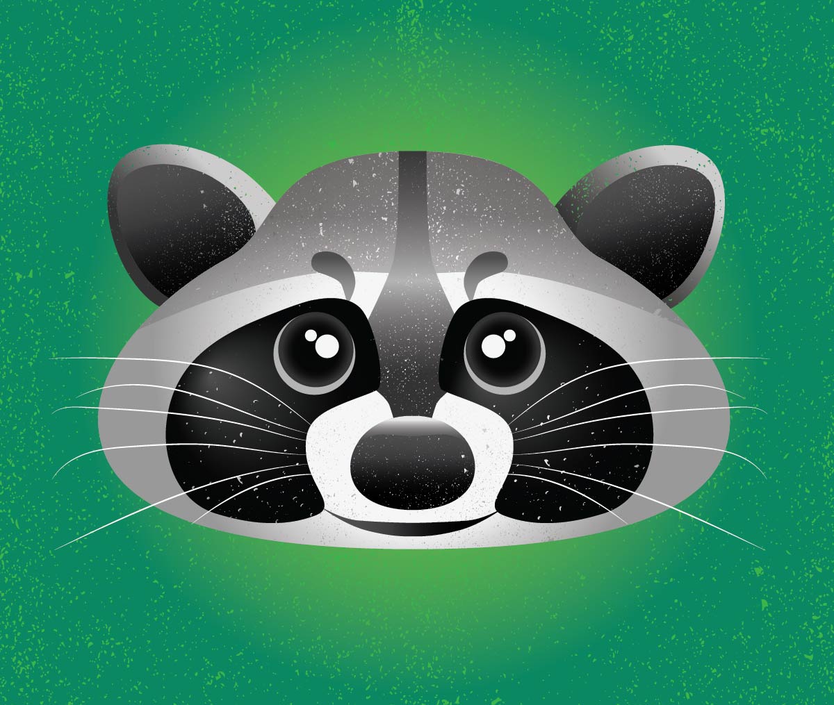
Neighborhood Critter Illustration
Thought it would be fun to do some illustrations. Here's a cartoon style illustration of a raccoon.
Interrobang Collective Animation
I just made my first animation using Photoshop and After Effects. I have some learning to do about creating the right size/resolution for the intended media host, but I think I'm off to a good start. And, I really like making these little stories. It reminds me of when I took video classes at Cornish College of the Arts. One of my favorite parts was adding the music and sound effects. Super fun!
Evolution of a Logo
Logos are the visual distillation of a company. They help guide viewers by showing them what industry you are in, and what they can expect from you in terms of quality and relevancy. There are many factors involved in developing a logo for a brand including company history, competition, where the company is vs. where they want to go, etc. Filling in these blanks can require research on the part of the designer, as well as the company, and is collected in a comprehensive creative brief. All of the research needs to be taken into consideration by the designer. Depending on company size, research and development can take months to over a year. And often, where logo concepting starts isn’t always where the design ends up.
I really enjoy doing logo work for small businesses. Below is one of the concepting transformations I went through when designing a logo for a new counseling business.
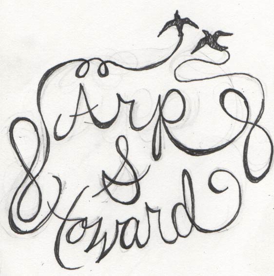
This was the first of several sketches on paper. The original copy included the option of a plus sign or an ampersand.
The client really liked the idea of a unified couple of birds flying out of chaos. She also like the idea of the swift. So I worked with the idea of having them come out of the "h" like a chimney.

I'm not an expert at hand lettering. But, in order to get better, and when I think the concept could work nicely with it, I try my hand at it.


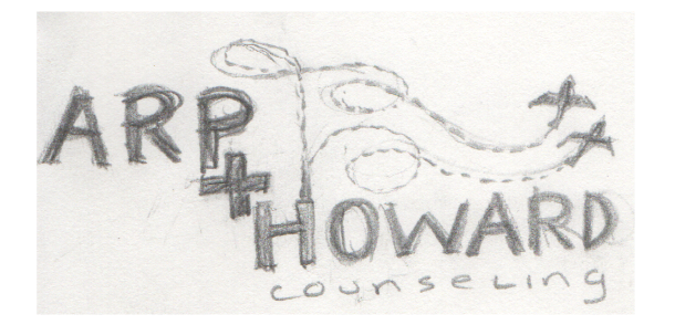
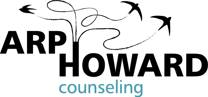
These are concepts from the first round of comps presented to the client. The artwork and type has all been re-done using Illustrator.
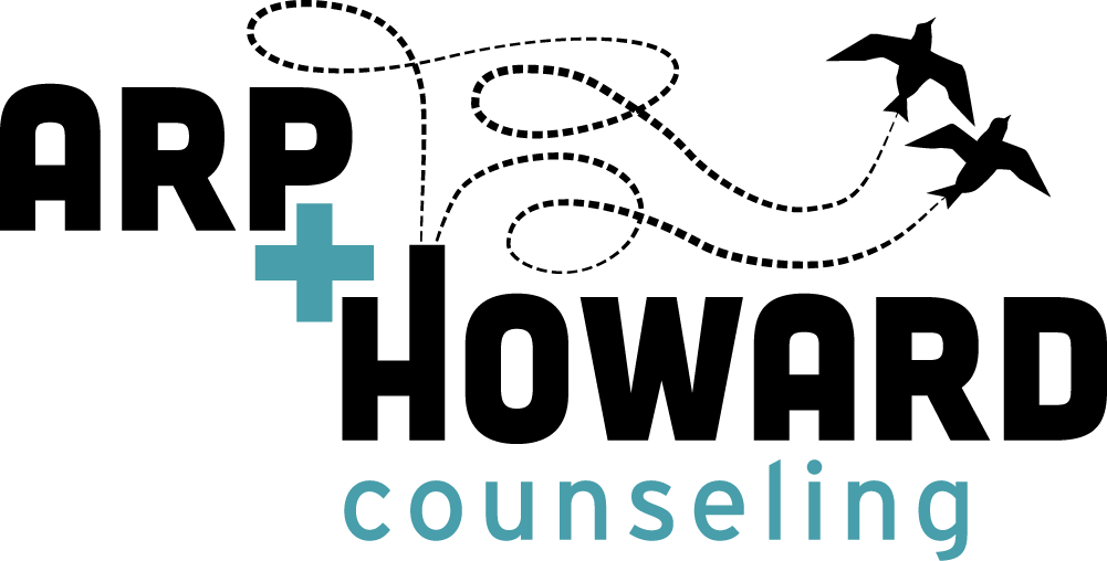
This is the final design. Birds and flight lines have been refined, and all kerning, leading, and tracking has been adjusted. Because of the popularity of the plus sign in so many of the new cannabis shops, we had to do away with it in our design. I think that the "plus/and" is still suggested in this layout. Now I'm working on an animated version—just for kicks and giggles.
view more logos here. Find out how I can help you with a logo by contacting me.
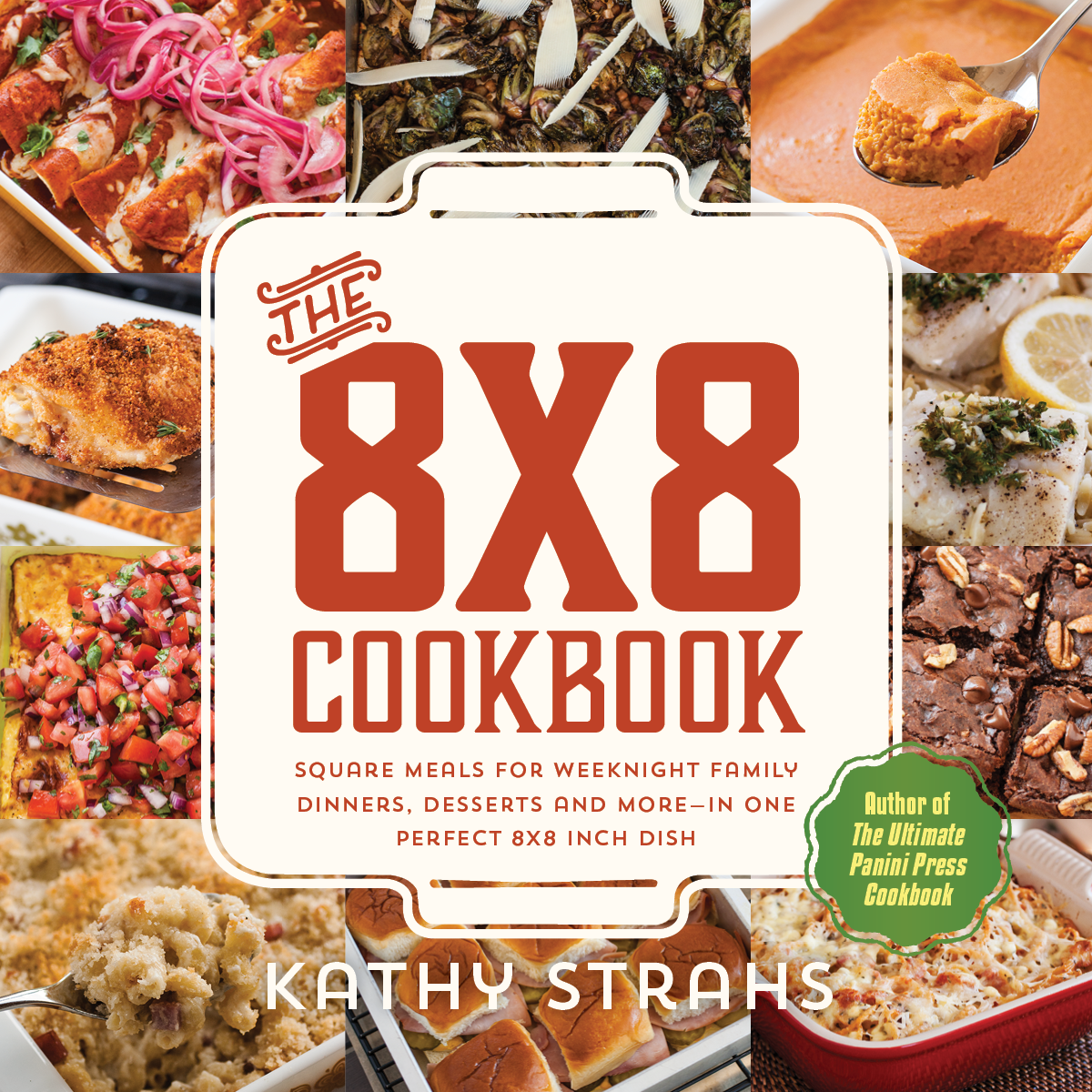
The 8x8 Cookbook by Kathy Strahs
I recently finished a cookbook cover for Burnt Cheese Press. There will be a Kickstarter launch for this book project next Wednesday, Sept. 30. Author Kathy Strahs has some great rewards lined up... http://8x8cookbook.com/get-the-book/
Book Design Proposal
Below are samples from a book design proposal I just put together. The book is historical non-fiction about a hotel created during the Arts and Crafts movement. The goal was to have the cover and interior have elements that are representative of that time period, but with a more updated feel.


New Book Project
Last week I made my company Interrobang Collective official. My partner, Poppy Milliken, and I received our business license. Even though we've been working together for a while now, it felt like a big step. We've also been working on a new book project, Bagging Groceries: Re-learning Humility in Long-term Recovery by author Dian Greenwood. You can read about the book on our website: InterrobangCollective.com. Below is the (in progress) cover I designed for the book.

Infographic Joy
I just finished illustrating and designing two infographics for a couple different projects I was working on at CLEAResult. I love the process of looking at the information that needs to be conveyed, and coming up with interesting visual ways of communicating it.

I Am Not a Poet Book Launch
Better late than never. Here are some pics from the book launch of I Am Not a Poet. This is the first book published by Portland's non-profit organization Street Roots. I designed the cover for which the illustration was provided by local art star, Chris Haberman. The book is available at Amazon, and local book stores, including Reading Frenzy - where the launch took place. Buy a copy, and support Street Roots.
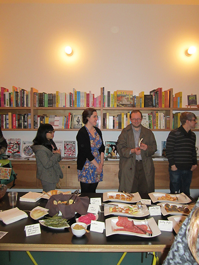
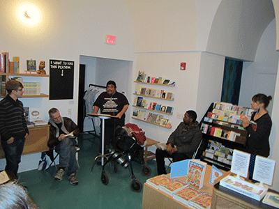


From left: Mary Locke (Marketing Coordinator/Designer), me (Book Designer/Design Coordinator), Israel Bayer (Executive Director of Street Roots), Vinnie Kinsella (Project Manager/E-book Designer). There were many others from the publishing world (PSU Publishing Program grads and Street Roots employees/supporters) who helped this project come to fruition that are not seen here. It took blood, sweat, and tears plus many donated hours to see this project through to completion. Good job everyone.
Unchaste Designs
Unchaste Readers Series is a women-only literary group that presents readings of poignant, passionate, and sometimes funny poetry, memoirs and short stories around Portland. I recently had the privilege of creating a logo lockup for the series. My inspiration was flames, the female form, vessels, and pods. For more info you can visit their FB page: https://www.facebook.com/UnchasteReaders

New Year of Ad Design
I've been working on a lot of ad designs lately. Below is my latest for River Dental. The client first had me create a black and white ad for posting in Natural Awakenings Magazine. Then for the Feb. edition he had me colorize it. Peachy Keen!


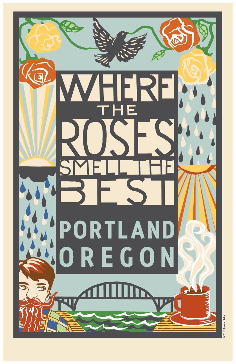
Posters for Sale
Someone emailed me recently requesting to buy a poster of the book cover image I illustrated for the Roosevelt HS anthology, Where the Roses Smell the Best. I wasn't planning on making posters, but thought that was a great idea because I'd heard some people saying they purchased the book for the cover. So, I changed the text a little, and had them printed. Now you can own one, or get one for a Portland loving friend for the holidays. Send me an email if you're interested in purchasing a poster: lorna at lornanakell.com
11X17 archival, autographed print: $35 + shipping
12X18 non-archival, autographed print: $10 + shipping
(Note: the book is available for purchase at Powell's, and several other Portland booksellers.)
Promoting Books for Non-Profit Organizations
Promoting books for non-profit organizations who want to publish can be challenging due to the lack of funding for such projects. Here are some strategies to market and design for these projects on a shoestring budget:
- Think outside the norm. There are several expected collateral items like posters and bookmarks, that are always good to have. But, in order to make a splash in this media saturated world, you have to be a little more creative. Is there an item that is representative of a theme in the book that could be labeled with the website and book cover (like matchbooks or nail polish).
- Think about gorilla marketing strategies. What is something that can be done or placed in people's everyday surroundings that will make them stop and take notice because it is discordant? How about a chalk drawing on the sidewalk, or signs placed in unusual locations.
- Look to your friends and connections for opportunities. Can someone donate an event space? Can you find a way to collaborate and share the media light with a fellow organization?
- Use your volunteers wisely. Volunteers are helping for the love of the organization, to make connections, and to learn. The best way to insure that their eagerness doesn't turn into burnout is to be organized and make communication a priority.
For a book project I'm working on for Street Roots, I conceived of, and created give-aways in the form of small, one-serving coffee bean bags. This was my process: I got the beans and burlap donated by Caffe Vita. I happened to have some plastic baggies on hand from another design project to use to seal in the beans for freshness. I bought black twine to tie the bags off with from Collage on Alberta. I designed the layout for the tags incorporating the art of the illustrator (Chris Haberman) that will be used for the final book cover. I printed and cut all the tags. I cut and sewed all the mini burlap bags, and assembled all the various parts. Total cost: $22 Total woman hours: 17
Below are photos of the end product. They were distributed at Wordstock to promote, I Am Not a Poet (to be launched Feb. 2014).

I put my vintage singer (that only does a straight stitch - forward and backward) to work. This little workhorse had no problem tackling burlap.


I added a QR code to the back that links to the I Am Not a Poet landing page.


Copy written by marketing team member, and edited by me to fit the format and incorporate a few important elements, like the coffee donor.
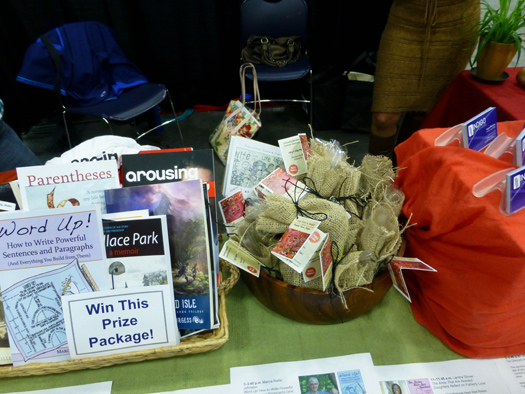
Bags in place at Wordstock.
On Design and Working at Ooligan Press
Connect the dots. That’s what I attempt to achieve with my design work. The dots are product, audience, message, organization identity, and organizational goals. The tools used to connect the dots are research, experimentation, and refinement of concept in execution. The results should contain an element of mystery, a balance between showing and telling, and a layout that portrays a thoughtful and accurate representation of the intention of the design piece.
Design is about supporting the marketing efforts of your client. During the preparation process for working on a book there are several requirements on my checklist: Read the manuscript, know the audience and what they expect from the genre, know what the comparative titles look like, and know how and where the book will be sold. My checklist is very similar when I’m designing collateral. I enjoy doing communications marketing, so when I’m working with an organization like Ooligan Press I’m always asking myself, how else can this publishing house and publishing program reach their intended market? Is there a marketing opportunity that could be capitalized on by conceptualizing and creating a particular piece of collateral? Are there ways the Design Workgroup can help the publishing house be more consistent with its branding efforts (e.g., through the use of color and repetitive design elements, or by always including web addresses and social media information on outreach materials)? It’s important to look at both the small details and the big picture.
From a background working mostly in small-budget organizations I know the importance of having versatility in skills, as well as in design styles. In the design world it’s often important to be able to keep up with the Joneses. In order to continually produce relevant designs, a designer always needs to be looking—at everything. Having been a professional artist for over thirteen years prior to designing and illustrating, I’m in the habit of looking. I apply this same strategy to my design approach. I look at art in galleries, fine art and design magazines, architecture, movies, bookstore layouts, websites, local clothing shops and restaurants, nature, etc. I don’t discriminate, because I never know when I might need to pull from this bank of images.
In book cover design and illustration, I strive to appeal to the visual intelligence of my audience by offering an element of mystery, where appropriate. As in good writing, in visual imagery there also needs to be a balance between the showing and telling of a story. I don’t believe that people like to be told the whole story. Instead, they find making connections between text and image rewarding. Like Chip Kidd said in his Ted Talk, you don’t show a picture of an apple next to the word apple. People’s brains automatically conjure up that picture (Of course, one exception to this rule is children’s books. Learning readers often need a visual cue to reinforce the words they are reading.) Knowing the visual language of the culture for which you are creating, and playing with inventive ways of tapping into a story with visual cues provides a foundation for intelligent storytelling.
Designing book interiors and collateral require using not only a good eye for compositional layout, but also the ability to organize information—creating a hierarchy of text and image that succinctly communicates the message. In both book interiors and collateral design my editorial and copywriting skills have been assets in creating informational systems. Although I wouldn’t consider myself an editor, having basic skills in this area has helped me. Knowing when rules have been broken, and when you can break or slightly alter them is crucial to dealing with text. There have been a number of times my copyediting and proofing skills have helped me add a missing word here, or turn an en dash into an em dash there.
One of the most rewarding aspects about being a student in the PSU Publishing Program and staff at Ooligan Press was the freedom given us to restructure and improve processes, and to create new initiatives. Because the publishing house was considered a “learning press,” as manager I set a goal of connecting the Design Workgroup with design professionals. The impetus was to make sure we continued to learn new skills while keeping up with the press’s production needs. I implemented a process using Flickr for sharing research, and early stages of design work that proved helpful in the design development and critique process. I also reached out to the greater publishing and design community to gain feedback on our designs via critique. Through spearheading the PSU Publishing Program sponsored event, Transmit Culture, I fulfilled a vision of mine to connect Ooligan Press’s student-staff with publishing professionals through on and off campus lectures and panel discussions. My hope was to establish the PSU Publishing Program as a hub for publishing professionals who want to network and learn from one another.
To me, design is more than producing visually appealing layouts. It’s about paying homage to tradition, while embracing innovation. It’s about connecting the dots between people and unifying community. Successful design uses a common language to bring people with similar interests together. In the words of Robert L. Peters, “Design creates culture. Culture shapes values. Values determine the future.”
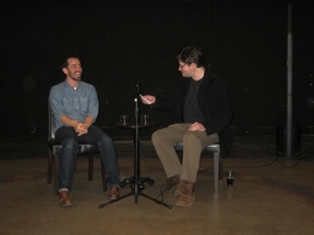
Transmit Culture Launch
Thurs. Feb. 21 was the official launch of a new PSU lecture series titled Transmit Culture: A Series of Conversations about Publishing. This is a project that I spearheaded in an attempt to give the publishing community, as well as Publishing Program students, an opportunity to network and share points of view about the future of publishing while hearing from publishing experts. The launch featured a Q&A with Eli Horowitz and Paul Collins - both with ties to McSweeney's. There were over 100 people celebrating the launch at Artist Repertory Theater. The series will continue later in the spring with a panel discussion featuring middle grade and YA publishing professionals.