
Evolution of a Logo
Logos are the visual distillation of a company. They help guide viewers by showing them what industry you are in, and what they can expect from you in terms of quality and relevancy. There are many factors involved in developing a logo for a brand including company history, competition, where the company is vs. where they want to go, etc. Filling in these blanks can require research on the part of the designer, as well as the company, and is collected in a comprehensive creative brief. All of the research needs to be taken into consideration by the designer. Depending on company size, research and development can take months to over a year. And often, where logo concepting starts isn’t always where the design ends up.
I really enjoy doing logo work for small businesses. Below is one of the concepting transformations I went through when designing a logo for a new counseling business.
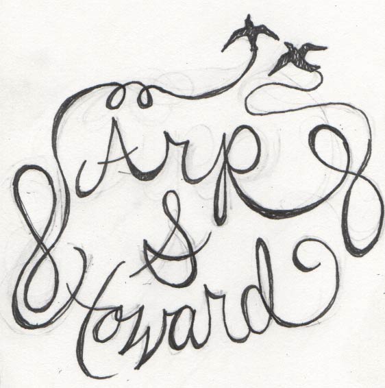
This was the first of several sketches on paper. The original copy included the option of a plus sign or an ampersand.
The client really liked the idea of a unified couple of birds flying out of chaos. She also like the idea of the swift. So I worked with the idea of having them come out of the "h" like a chimney.

I'm not an expert at hand lettering. But, in order to get better, and when I think the concept could work nicely with it, I try my hand at it.


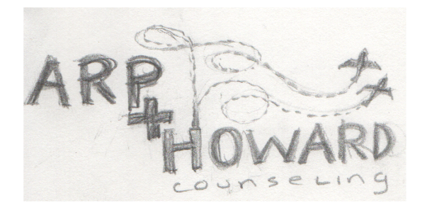
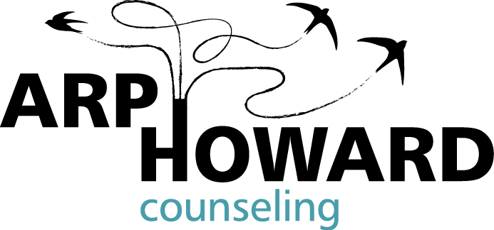
These are concepts from the first round of comps presented to the client. The artwork and type has all been re-done using Illustrator.
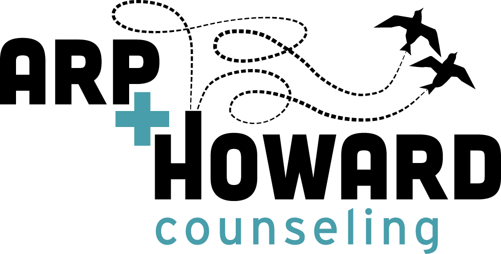
This is the final design. Birds and flight lines have been refined, and all kerning, leading, and tracking has been adjusted. Because of the popularity of the plus sign in so many of the new cannabis shops, we had to do away with it in our design. I think that the "plus/and" is still suggested in this layout. Now I'm working on an animated version—just for kicks and giggles.