Process: Children's book cover design
PRE-DESIGN
Even before a children's book is placed into the hands of a designer, there are many working pieces that have to be juggled by several different people. It can take several months to years for a writer/illustrator to develop a story for children. Often times, the writer and illustrator are separate people; paired together only after the manuscript is completed and taken on by a publisher. The writing alone, can take many passes by a variety of editors (developmental, copyeditors and proofreaders) to have it developed into a workable story.
THE DESIGN PROCESS
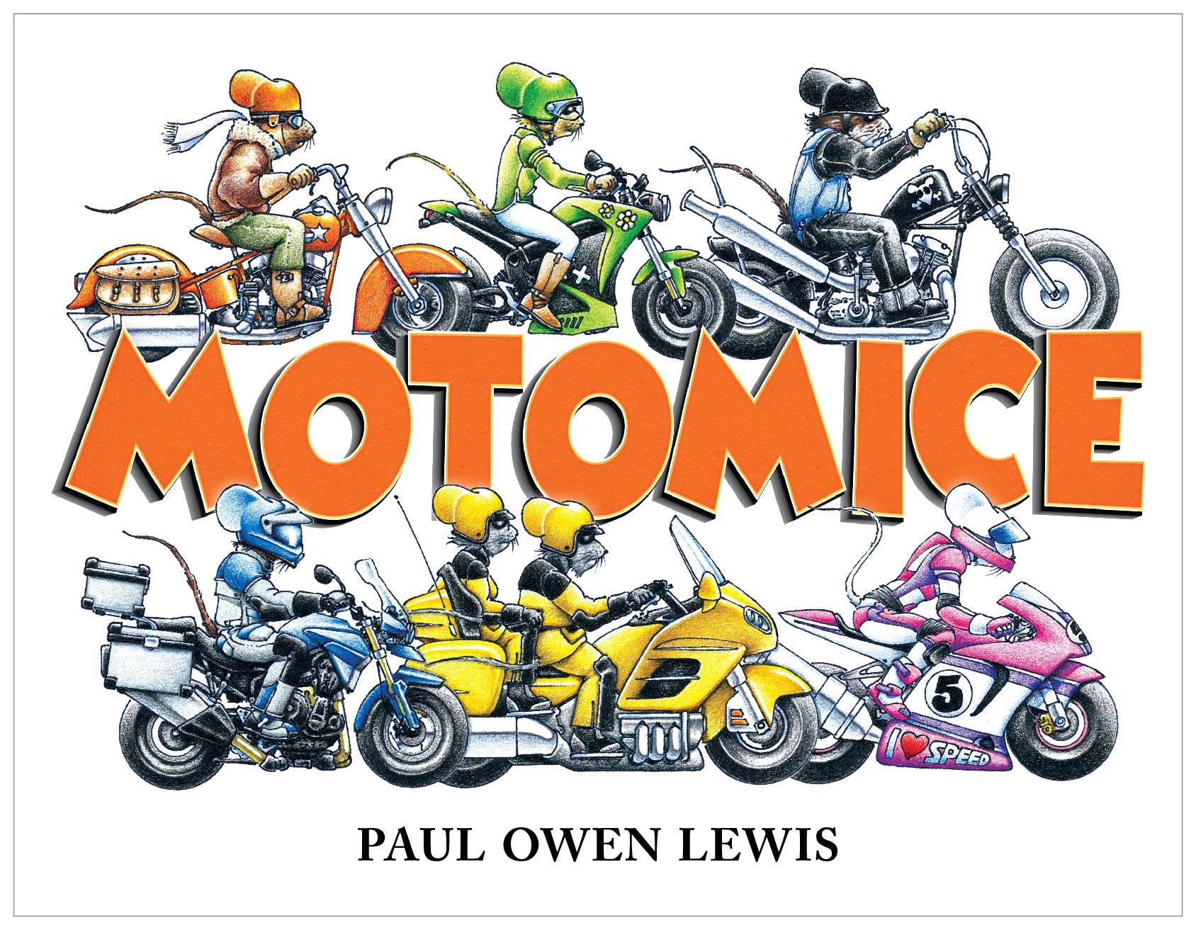
Below is list of several of the steps I went through to create the cover design of MotoMice, by Paul Owen Lewis. This book is being published by Beyond Words. Customarily, the author/illustrator doesn't have much say in the final design, but in this case I had to bend some of my conceptual input to his original vision. Also note that this whole process was done with several rounds of comps revised with copy and design edits from the author/illustrator and managing editor.
Step 1: I took professionally photographed artwork into Photoshop and removed the paper background, cleaned up any scruffy edges and deleted areas of the bikes that you would be able to see through. There's an art to this because at times you have to interpret the intention of the artist when erasing visual content.
Step 2: Colors of the cover artwork were adjusted in Photoshop to match the illustrations used in the interior, which were slightly more saturated. This artwork was then exported from Photoshop and used in Illustrator.
Top: Raw illustration provided by author/illustrator. Bottom: Artwork with background erased in Photoshop, and color corrected to match interior art that was more saturated.
Step 3: The fonts for this cover had already been chosen by the author/illustrator, but I made changes. I did a basic adjustment to the tracking and kerning of the author name for a more balanced look. But, the biggest typographic change was turning the title into 3D art lettering. For this, I used Illustrator to create the 3D gradient shadow effect (with the blend tool) and to build the separate layers of color, texture and transparency for the orange front. Then I exported it as a high resolution JPEG and sucked it back into Illustrator so I could use the mesh tool to create a slight warping effect.
Top: Original unaltered font. Middle: Illustrator layers used to build a more 3D textured version. Bottom: Mesh tool used in Illustrator to manipulate the shape of the word art.
Step 4: The final design was then exported and placed into InDesign where I completed the full dust jacket. The dust jacket had additional artwork that required the same type of cleaning up and color adjustment. Then all copy was placed and typeset. Typesetting requires the same sort of love and care as dealing with artwork. Some considerations are the right fonts, paragraph formatting, colors. Then there are the details like replacing hyphens with En dashes in between numbers, controlling the use of hyphenation—fun stuff like that.
Full cover layout. Color adjustments were made to all illustration elements. An outside glow was placed on the bottom row of mice so they move to the front of the letters, and a drop shadow was created just behind each overlapping letter tip to move the title in front of the top mice row. The same title letter art was used for the drop caps on the dust jacket flaps.
Step 5: For press, the InDesign file will be exported as a print quality PDF with printer marks in place, and fold marks placed in the slug.
All of that for a simple children's book cover? Yes. And it's important not to miss a step because you have to make the 4–8 year-old kiddos happy and inspired to sit down and learn about the importance of motorcycles and family through the use of kick-ass mouse illustrations.
Coming up: a post about the interior design process for MotoMice.
To see more book offerings by Paul Owen Lewis you can visit his website: www.paulowenlewis.com


